
History of the RCHS
The Railway & Canal Historical Society was formed by what became the founder members at a meeting in the Grandmere Hotel in Preston on 4th September 1954. Those present were Maurice Greville, Bertram Baxter, Gordon Biddle, Charles Clinker, Ray Cook and Kenneth Seaward with Charles Hadfield and Geoffrey Holt in absentia (both Hadfield and Holt had signified their wish to be associated with whatever migh be decided). These eight people unaminously agreed to form the Railway & Canal Historical Society, with themslves as founder members. By the end of the year the Society had in its membership the majority of the leading railway and canal historians at that time.
Charles Clinker wrote a review of the Society in The Amateur Historian, Dec1956
For a list of our Presidents, other principal Officers since 1954, and recent AGM locations click here. (It seems that to become President in our early years it was advantageous to be called Charles!)
For reflections after 25, 40, 50 and 65 years use the following links:
The first 25 years: RCHS at 25
The first 40 years: RCHS at 40
The first 50 years: RCHS at 50
The last 15 years: The Society, 2004-2019
Additionally at the 50 year anniversary Gordon Biddle looked back to the early years: ReflectionsAfter50Years
Before January 1959, the Journal was the only regular publication and contained routine society information as well as articles. Here you will find Bulletin number one – January 1959.
The NW Group was formed in 1958. The RCHS Journal published a report on its first year. For extracts from the Journal and an editorial note by Roger Taylor use the link: NW Group: the first year
In 1973 Waterways World included an article reviewing some of the activities of the RCHS – click Waterways World, Sept 1973
Our Logo – and why our ‘house colour’ is blue
Grahame Boyes provided the following information in the November 2004 Journal:
As a footnote to the history of the Society, it should be recorded that its logo (or badge or emblem, as it was then called) was first used in January 1965 on the cover of the first printed issue of the Journal. (Previous issues had been reproduced by a duplicating machine.) It appeared on the Society’s headed notepaper from about the same date.
The design, in the style of a trade token, was undertaken by Kenneth Lindley (1928-86), a notable wood engraver. (The British Library catalogue lists 27 books that he illustrated and, in some cases, also wrote.) He was a member of the Society from 1964 to 1976. His original design was executed as a woodcut, from which printing blocks were then made. Maurice Berrill, who was the Council member delegated to deal with Mr Lindley, recalls that, when the design was shown to Council, there was general approval of the overall style, ‘but there was some disquiet among the more traditional members about what they saw as a rather quirky and unrealistic depiction of an antique locomotive, the smoke from which artistically masked (or perhaps masqueraded as) the ampersand in the Society’s initials, while its wheels appeared to be about to burst through the crown of the viaduct arches, to the considerable detriment of the narrow-boat below’¹
In the end, however, the design was adopted without further fuss and brought into use without any mention in either the Journal or Bulletin. In 1966, members’ notepaper was made available, carrying in the top left-hand comer a smaller version of the logo surrounded by the words `Railway and Canal Historical Society : Member’. Like the official letter heads, it was printed to a high standard by another long-standing member, John H Denton, who was then running the Cottage Press at Codsall, Staffordshire. A small file, containing some sample off-prints from the blocks, was found in a collection formerly the property of the late member, David Garnett, and has been returned to the Society. The logo which has been printed on the cover of recent issues of the Journal has suffered from being a copy of a copy. It is planned to use a crisper version reproduced from one of these early off-prints, which will clearly show the designer’s initials.
Navy-blue had already been adopted as the Society’s ‘house colour’², having been used for the banner heading of the Bulletin since the first issue in January 1959, and this colour was used for both the Society’s and members’ notepaper. At the same time the logo was produced as a members’ lapel badge of chromium-plated cast metal with a blue and white enamelled background. In 1972 it was woven in white on navy-blue or dark red members’ ties. (There have been two later editions of the members’ ties in different colours.) Over time, the shade of blue used on the letterhead became progressively brighter. When in 1995 the East Midlands Group made available a members’ sweat shirt carrying the logo, it was a bright blue that was one of the colours offered.
¹. Letter to the writer, March 2004
². In the following March 2005 Journal, Gordon Biddle added:
Grahame Boyes’ letter has stirred a memory of the choice of blue for the Society’s ‘house colour’. At the first Council meeting, as Hon Secretary I was asked to obtain a supply of printed letter-headed notepaper. I asked, ‘What colour?’ Clinker suggested green, but I saw Baxter shaking his head. Greville said he didn’t mind what colour was used provided it wasn’t red or black. So I visited a local jobbing printer and chose a serifed typeface in royal blue, which I thought looked appropriately dignified for what we hoped would become a learned society, and blue has remained our house colour ever since.
Discussions among members on the logo continued and in 2010 Tony Jervis (Bulletin Editor at the time) published the following items in The RCHS Bulletin
From R&CHS Bulletin No 426, July 2010.
LOGO LOCO COULD CAUSE RAILWAY AND CANAL BRIDGE COLLAPSE
Our member Mr Philip Knight writes that the R&CHS logo has always bothered him because the bridge is structurally unsound. The bridge arches would never support the weight of the loco, and the wheels would come right through the roof. He enclosed a modified version (left, below) that he has produced and would be interested to know if members think it is an improvement over the existing version (right, below, which has been enlarged from the copy on the Bulletin masthead).
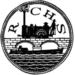
Philip Knight’s modification
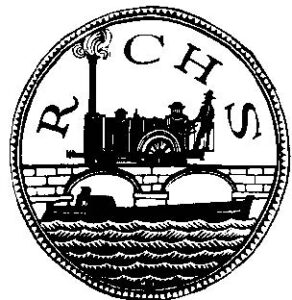
Existing version
From R&CHS Bulletin, No 427, September 2010.
THE LOGIC OF THE R&CHS LOGO
Philip Knight’s note in the July-August Bulletin, N° 426, p.12, regarding the Society’s logo attracted my attention for two reasons. First, there was the intrinsic interest of the subject. Second, it so happens that I was personally involved in the introduction of the logo, all of 46 years ago, which, in brief, arose as follows. I joined the Society in January 1955, served as Hon. Secretary (1958-60), Hon. Treasurer (1960-62) and Member of Council (1962-65). From time to time there were discussions in Council on the lines of ‘Wouldn’t it be a good idea to have a badge’, especially as we were then developing proposals for a fully printed Journal . It was realised that we had a new member, Kenneth Lindley (1928-86), already a noted author, wood engraver and book illustrator, who had joined in January 1964, listing his interests as ‘Canals, Transport architecture and Industrial archaeology.’ As my own job in those days was in publishing, Council asked me to negotiate on its behalf with Lindley, who later in 1964 duly produced the design with which we are all so familiar. It was based quite deliberately on the style of 18th century trade tokens, often issued by canal companies and others, with the
characteristic milled rim, the whole expressed with the artistic licence commonly evident in such coinage.
Referring again to Philip Knight’s suggestion, I recall that when the artwork was shown to Council there was general approval, but there was some disquiet among the more traditional members about what was seen as a rather quirky and unrealistic depiction of an antique locomotive, the smoke from which artistically masked (or perhaps masqueraded as?) the ampersand in the Society’s initials, while its wheels appeared to be about to burst through the crown of the viaduct’s arches, to the considerable detriment of the narrow boat on the canal below! In the end, however, the design as submitted was formally adopted without further fuss and seems to have found universal acceptance. Rather surprisingly, there wasn’t any proclamation in either the Bulletin or the pages of the Journal and, without editorial or other comment, official use of the new logo was inaugurated on the cover of the very first letterpress printed issue of the latter publication, namely Vol. 11, N° 1, January 1965.
Thereafter, there are few published mentions of the logo, except rather oblique references to its use on members’ stationery and badges (see Bulletins 80 (September 1965), 84 (January 1966) and 85 (February 1966). Kenneth Lindley himself, whose engraved initials are visible at the foot of the circle, resigned his membership of the Society in 1976 and is understood to have died ten years later.
Finally, when the Society celebrated its Golden Jubilee in 2004, our member Grahame Boyes, knowing of my past involvement with the logo, very kindly allowed me to comment on his draft of a comprehensive letter, the final version of which was published in the Journal, Vol. 34, Part 10, N° 190, November 2004, p.695.
None of this, of course, answers the specific point made by Philip Knight —— and possibly many others! All I would venture to suggest is that what has so far stood the test of time might perhaps be allowed to remain in its original and historic, if slightly inaccurate, form. On the other hand, with due respect to the memory of the late distinguished artist and R&CHS member, and always assuming copyright in the design is held by the Society, I would not personally object to Philip Knight’s subtle redrawing being adopted for the Society’s use as quietly and unobtrusively as was the original all those years ago. How about that for compromise!?
MAURICE BERRILL (Member N° 73).
– — — — — — — — — —
In the latest RCHS Bulletin you asked for views on the modified logo (health and safety issues with the bridge!). I think that the version supplied by Philip Knight [below, right] is an improved design but also think that there is now too big a gap between the letter ‘R’ and the locomotive chimney. I have moved (and rotated) the ‘R’ slightly on the attached version [below, left]. It is only a small change but I think it does improve the relative position of the initials. My apologies if you have received dozens of other versions as you will be fed up with them by now!
Peter Martin.
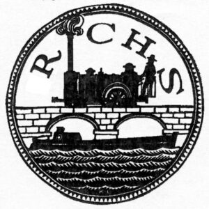
Peter Martin’s modification
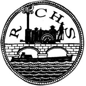
Philip Knight’s modification
[Editorial note. —— The esteemed Mr Berrill and Mr Martin are wrong about the stooshie that might have been stirred up by a suggestion that the Society’s logo, badge or emblem falls foul of health and safety standards. The above two items are the only responses I have received. AMJ.]
However, . . .
From R&CHS Bulletin No 428, November 2010.
OUR EMBLEM’S NO PROBLEM
I was alarmed that any serious thought might be given to the unwarranted meddling with something that has continued unchallenged for 46 years. In the name of ’elf ’n’ safety! We have learned to automatically reject anything (well almost) that attaches that claim.
I read Maurice Berrill’s account in Bulletin 427/10 and agree that as it is modelled on 18th-century trade tokens then any move to exactness would be totally uncalled for. Otherwise it would need to be completely redrawn to eliminate any hint of history.
We are a historical research society; we do not need to follow trendy fashions for renaming, redrawing all our heritage. Who else fails to find a pub or inn because some child in the marketing department has changed the name to something totally unrelated to the site; we all know of local examples of this idiocy – I note that some are now reverting after a fall in business.
A local society recently changed its name after ONE woman objected to its having ‘men’ in the name. Why do people think that the name (which was most descriptive) is more important than the objectives – better to eject that person than be deflected from the cause?
Can the suggestion be consigned to the waste bin with no further mention.
Martin Snow
It seems our original correspondent was worrying unnecessarily, as our civil engineering colleagues have long been well versed in the propping up of dodgy bridges and viaducts as traffic becomes heavier, as implied in this “anonymously” written message addressed to the Bulletin Editor apparently placed in an Ansell’s Nut Brown Ale bottle and thrown into a barge from a passing train at a canal and railway interchange basin not far from Salford Junction:
I was led to believe that the viaduct/aqueduct was strengthened by the addition of a reinforced concrete way-beam placed out of normal vision after its initial inspection by the Board of Trade before the Railway was opened to traffic.